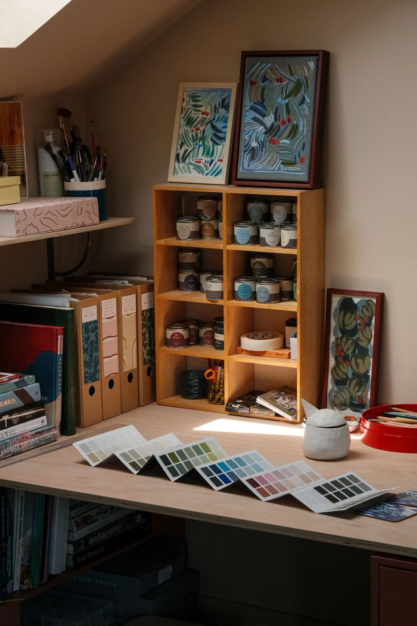
Design Diaries | Fenwick & Tilbrook
A Colourful Collaboration with Fenwick & Tilbrook x Imogen Heath Interiors

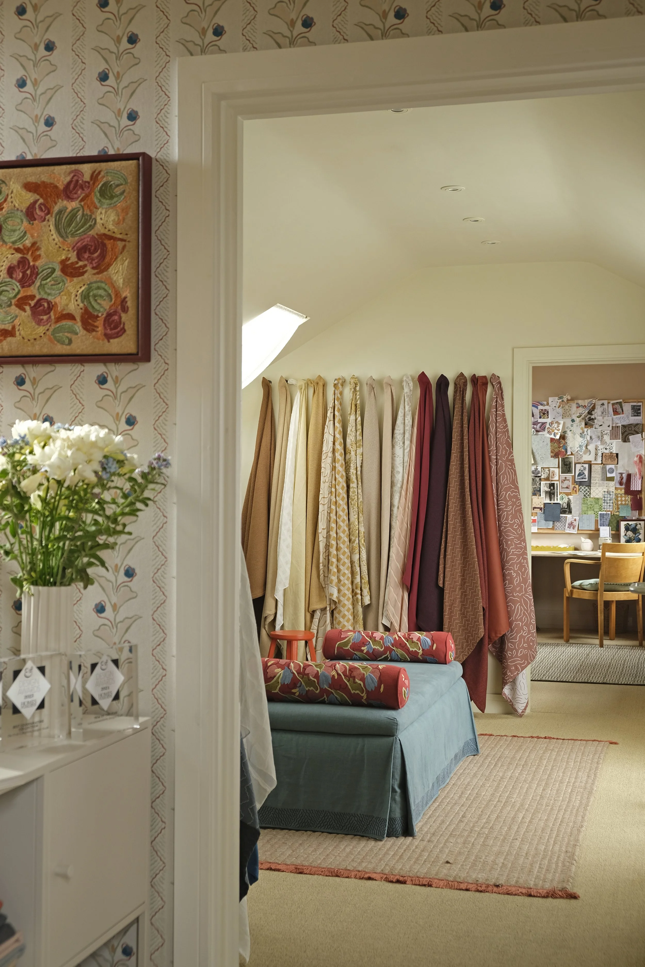
As a design studio with a strong focus on pattern and colour, collaborating with the paint and colour specialists Fenwick & Tilbrook felt like the perfect fit for our new Brighton-based showroom. The team at Fenwick & Tilbrook generously supplied us with their beautiful, pigment-rich paints, that sit perfectly alongside our fabrics, wallpaper and embroidery.
Exploring their extensive, nature-inspired palette was a true pleasure, and we couldn’t be happier with the result. The pigment rich paint responds so beautifully to the changing light, making our showroom feel alive with colour throughout the day!
Read on to explore their thoughtful approach to colour-making, and discover how to work with their palette in ways that feel intentional within your own interiors.
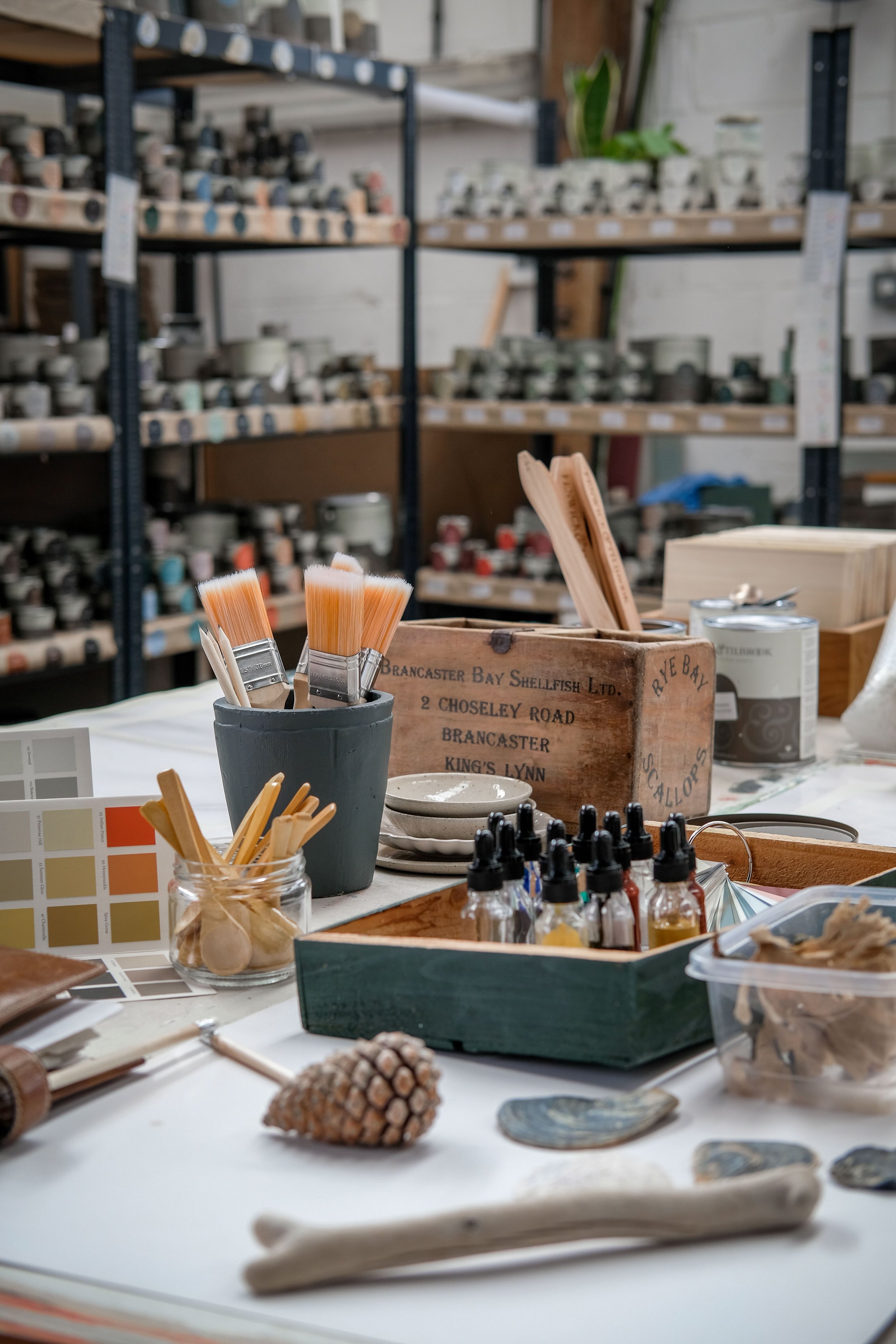
Fenwick & Tilbrook Studio
Can you tell us a little about how Fenwick & Tilbrook began?
Fenwick & Tilbrook was founded in 2016 by Simon and Clare Tilbrook, who set out to revive the manufacture of a paint brand that had ceased trading. By 2018, the brand had evolved into a passion project focused on creating premium, high-quality paints.
A decade on, we remain a proudly family-run, independent British paint brand based in Norfolk. From the beginning, we’ve been driven by a desire to offer something more considered and design-led within the paint world - combining the beauty designers seek with the durability needed to withstand the daily wear and tear of busy family life.
We pride ourselves on offering expert advice and exceptional customer service from our Norfolk workshop, where every tin of paint is made to order. I joined the journey in 2019 with my husband, Dave, relocating from Hertfordshire to become part of the family business that we now run together.
How do you approach creating a new colour?
When Clare creates a new colour, it begins with inspiration. We are lucky to be surrounded by it…from coastline to countryside and wildlife, Norfolk has a lot to offer!
We always think about how a colour will live in a space: how it behaves in different light, how it feels at different times of day, and how it sits alongside the wider palette so that its simple to incorporate into schemes and very easy to live with for years to come… far more important than buying into a fleeting seasonal trend.
You produce your paints in the UK. Why is that important to your brand?
Over 70% of our raw materials are derived from sustainable UK sources, something we don’t think many other paint companies can claim. For us, it’s about craftsmanship, integrity, and staying connected to place.
Fenwick & Tilbrook - Paint Colour - Raw Pearl
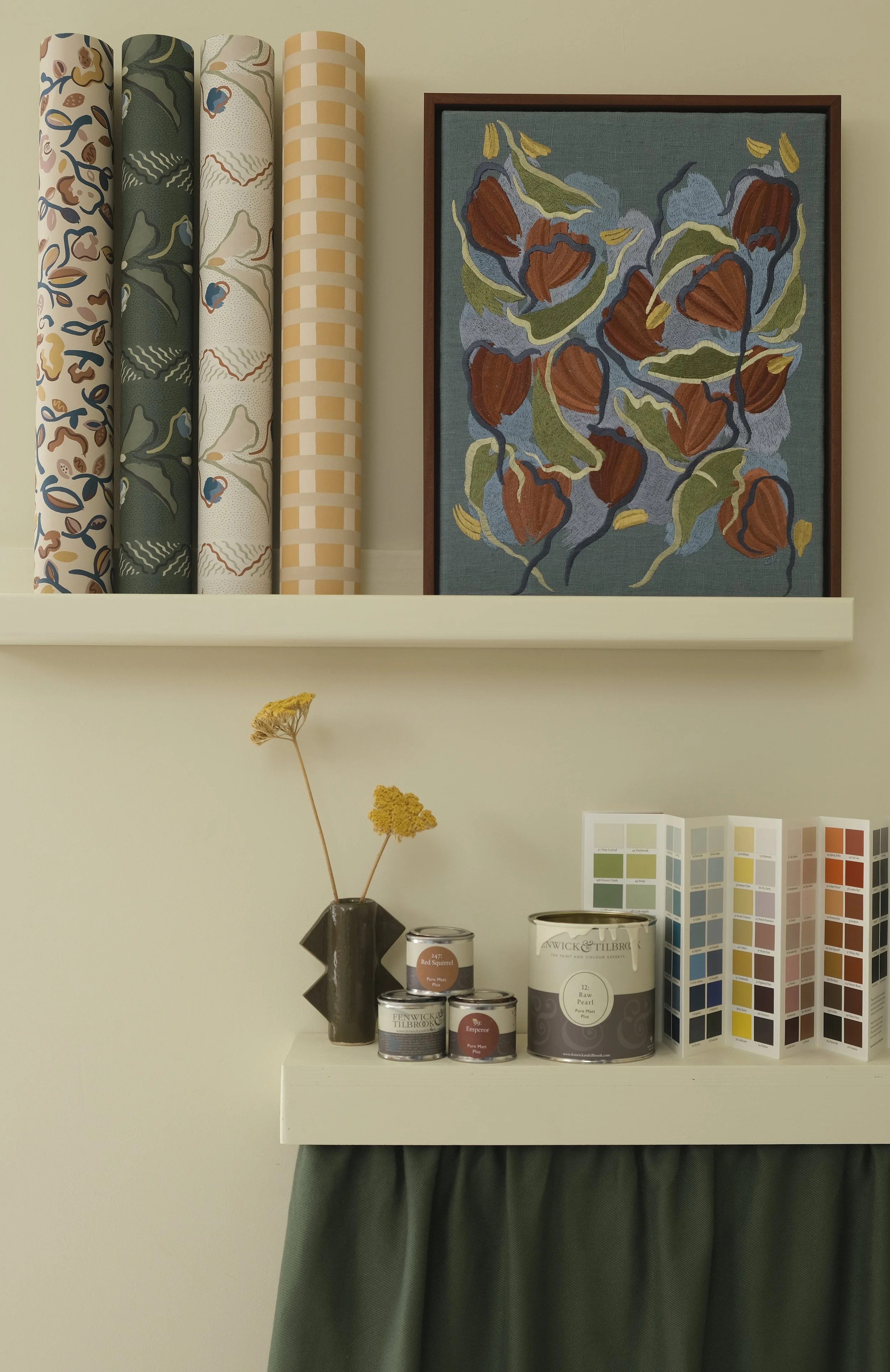
Fenwick & Tilbrook - Paint Colour - Raw Pearl
Fenwick & Tilbrook - Paint Colour - Wax Wing
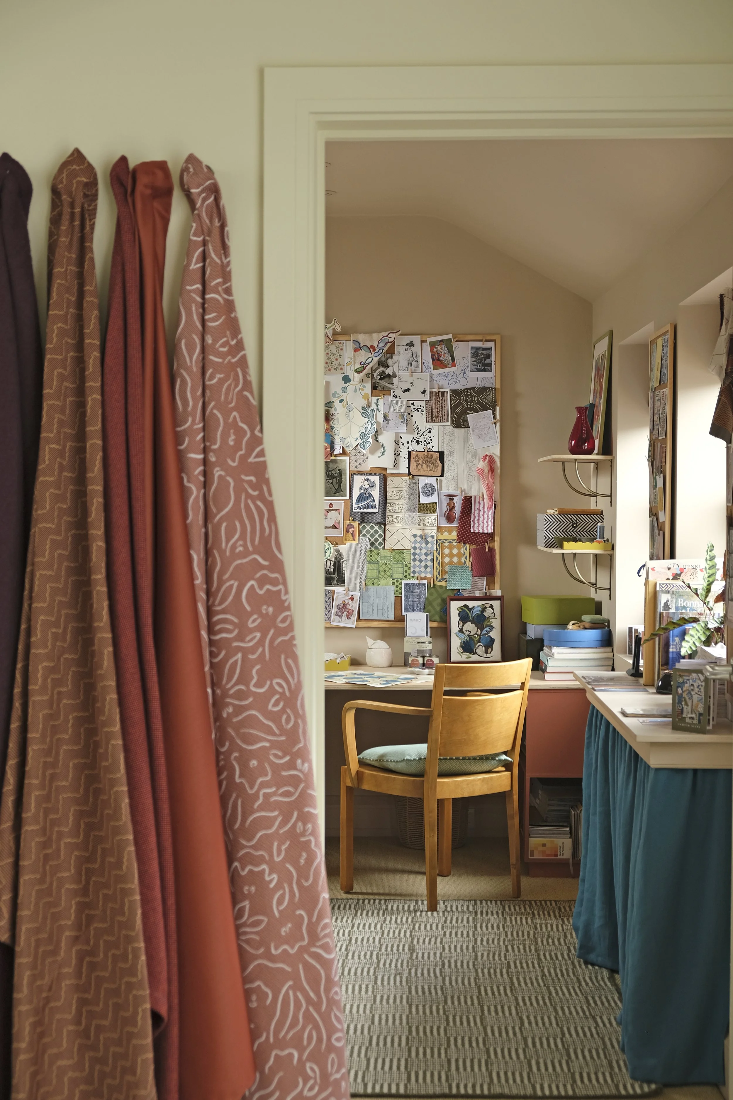
Throughout the space, we have used Pantile, Barn Owl, Raw Pearl and Waxwing. What were the inspirations behind these colours?

The Design Room - Waxwing – “New for 2026 and inspired by the very beautiful Waxwing, a winter visitor to Norfolk. Plaster pinks have been popular for a number of years, but this one is our most ‘neutral’ pink. Sometimes it’s pinky, sometimes it’s light brown. That’s the beauty of using high-quality pigments in our paint – the colour will gently shift in appearance as the light changes.”

The Showroom - Raw Pearl – “Raw Pearl sits within our core mid-neutrals. Designed it to feel understated but complex, with enough depth to shift beautifully in changing light.”

Accent Colour - Pantile - “Pantile is inspired by the traditional roof tiles used widely in Norfolk villages. This colour has been in the range since the very beginning. It captures the warm, earthy terracotta tone in a way that feels both heritage-led and contemporary. A real timeless paint colour.”

Woodwork - Barn Owl – “Barn Owl is a beautiful creamy off-white. Inspired by the soft underside of a barn owl’s feathers. It’s a very light neutral but has the hint of yellow to ensure it’s never stark.”
You have recently launched a new collection of 10 colours. Do you have any favourites, and how do these new shades sit within your wider palette?
The new collection is something I’m really excited about. Introduced to celebrate 10 years of Fenwick & Tilbrook. Rather than standing apart, these colours have been carefully developed to sit within our wider palette. My personal favourite is Shelduck but I need to find the right place to use that one – I feel like it could look fabulous on the right piece of furniture.
Are there colours people tend to overlook or feel hesitant to use?
Yes - people often hesitate with deeper or more characterful tones. Colours like rich berry shades or earthy reds can feel bold at first, but they’re often the most rewarding once used. Even our mid neutrals can be overlooked because on a swatch or against a white wall they feel too “dark” but once used on walls and ceiling, the colour envelopes you, making you wonder why you ever thought a bright white was a good option for your home.
What advice would you give to someone looking to use more colour in their home?
Drawing colours from fabrics or artwork is a lovely way to tie together a scheme that feels considered. If starting from a blank canvas entirely, start with nature as a reference - it’s where the most timeless and harmonious combinations come from.
I also encourage people to trust how a colour feels, not just how it looks on a chart. Always sample properly and see it in different lights. Don’t rush your decision or skimp on a colour match, it will only ever lead to disappointment!
Most importantly, I think small shifts can make a big difference, moving from a pale neutral to a more pigmented tone can transform a space without it feeling overwhelming.

Fenwick & Tilbrook Directors - Image courtesy of Fenwick & Tilbrook
With the opening of our showroom, you’ll be able to explore the full Fenwick & Tilbrook colour collection in person, alongside our complete range of Imogen Heath Interiors wallpapers, fabrics, and passementerie. This will give you the perfect opportunity to select your favourite paint colours for all your upcoming interior design projects.