Design Guide | Summer Greens
Summer green is a colour of balance, fresh but grounded, expressive yet calm, a palette that invites both play and stillness into the home.
From olive to soft chartreuse, summer greens offer a layered, natural palette, one that brings depth and ease to interior spaces. We’ve been working with them in the studio recently, exploring their nuances through woven pattern, natural textures and thoughtful pairings.
At Imogen Heath, colour is never just about a shade; it’s about a feeling, a reference, a memory. We see design as the meeting point of colour, pattern and craftsmanship, each one adding richness and meaning to the spaces we live in.

Green is one of the most ancient pigments in human history, crushed from malachite in Egyptian tomb paintings and evolving through time to become a symbol of both the natural world and renewal. It’s the colour of growth, balance, and calm, but it also carries a quiet optimism that feels especially present in summer.
Painters like Pierre Bonnard captured this softness: olive-toned foliage blurred with sun-faded walls, interiors spilling into gardens. Similarly, Milton Avery used mellow greens to evoke stillness and simplicity, always just the right side of warm. These references inform how we think about green not just as a design tool, but as an emotional one.
In interiors, summer greens echo the mid-century and post-war palettes of the 1940s–70s, when colour was comforting, not bold, and design was often handmade. It’s a palette that feels at home in both contemporary and characterful settings.
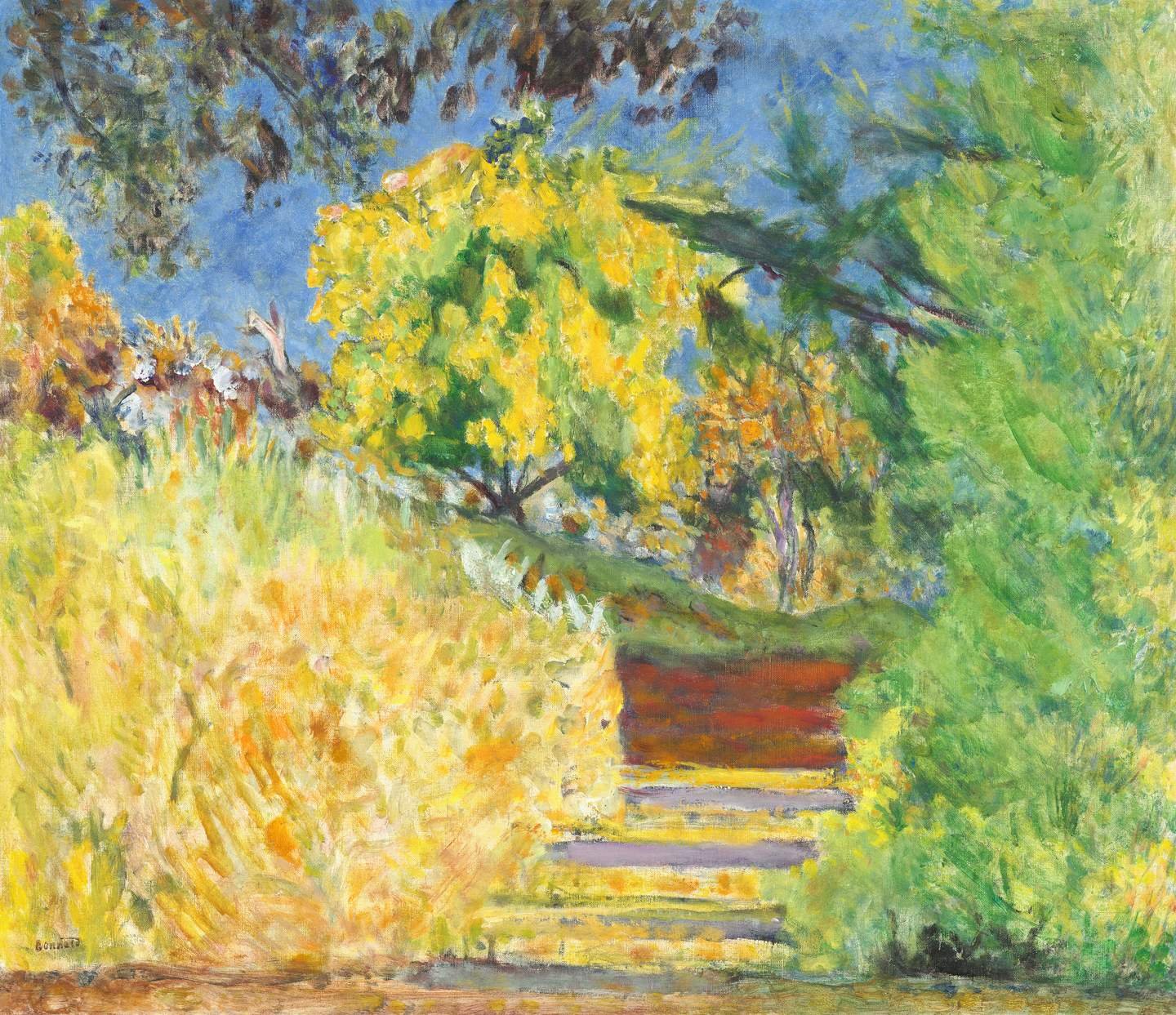

Milton Avery (1885-1965) Yellow Meadow
Summer greens in our collection span soft plains, expressive florals and structured geometrics. Pairing them is about contrast in texture, not just colour or pattern. A textured wool with a crisp geometric, placed alongside a painterly print, brings harmony to a space and interest through surface and feel.
Olive tones work well as a base, while citrus and yellowed greens offer lightness and lift. Mixing patterns — florals with stripes, plains with checks — creates rhythm and personality without overwhelming the palette.
What connects them all is craft. Many of our designs begin as hand-painted artwork, giving the finished fabrics a tactile, human quality. These details make green feel intentional, grounded and easy to live with.

Pattern has the power to shape a room. It guides the eye, creates rhythm and sets the tone. In green, it can ground a space or bring it to life, depending on how it's used. A structured geometric introduces order, while a looser floral or painterly stripe softens the edges and adds flow.
In our collection, many of the patterns begin as hand-drawn or painted artwork before being translated into weave or print. This gives them a natural variation that works beautifully when layered with plains or more defined motifs. Pairing different scales, such as a fine check with a larger repeat, creates balance without everything feeling too matched.
It's not about rules, but relationships. The pattern should feel purposeful, yet intuitive. Texture, colour and form come together to create spaces that feel individual and full of character.

Our plain wool melton is crafted from 100% wool, woven in Scotland. It has a beautiful matt handle. Available in a gorgeous spectrum of colours, carefully selected to complement Imogen Heath’s printed fabrics. This fabric is perfect for upholstery and is suitable for both commercial and domestic settings.
Composition & Details
Composition: 100% Wool
Width: 140cm
Weight: 380gsm
Martindale: 25,000
FR: BS5852: 1990 CM+5
Care: Dry clean only
How to order
Please get in touch with us for trade pricing and lead times.
Sign up for a trade account or locate your nearest showroom here.
Important information
Possible colour variations due to screen displays might occur; we advise ordering a sample online or from a nearby showroom before making a purchase.
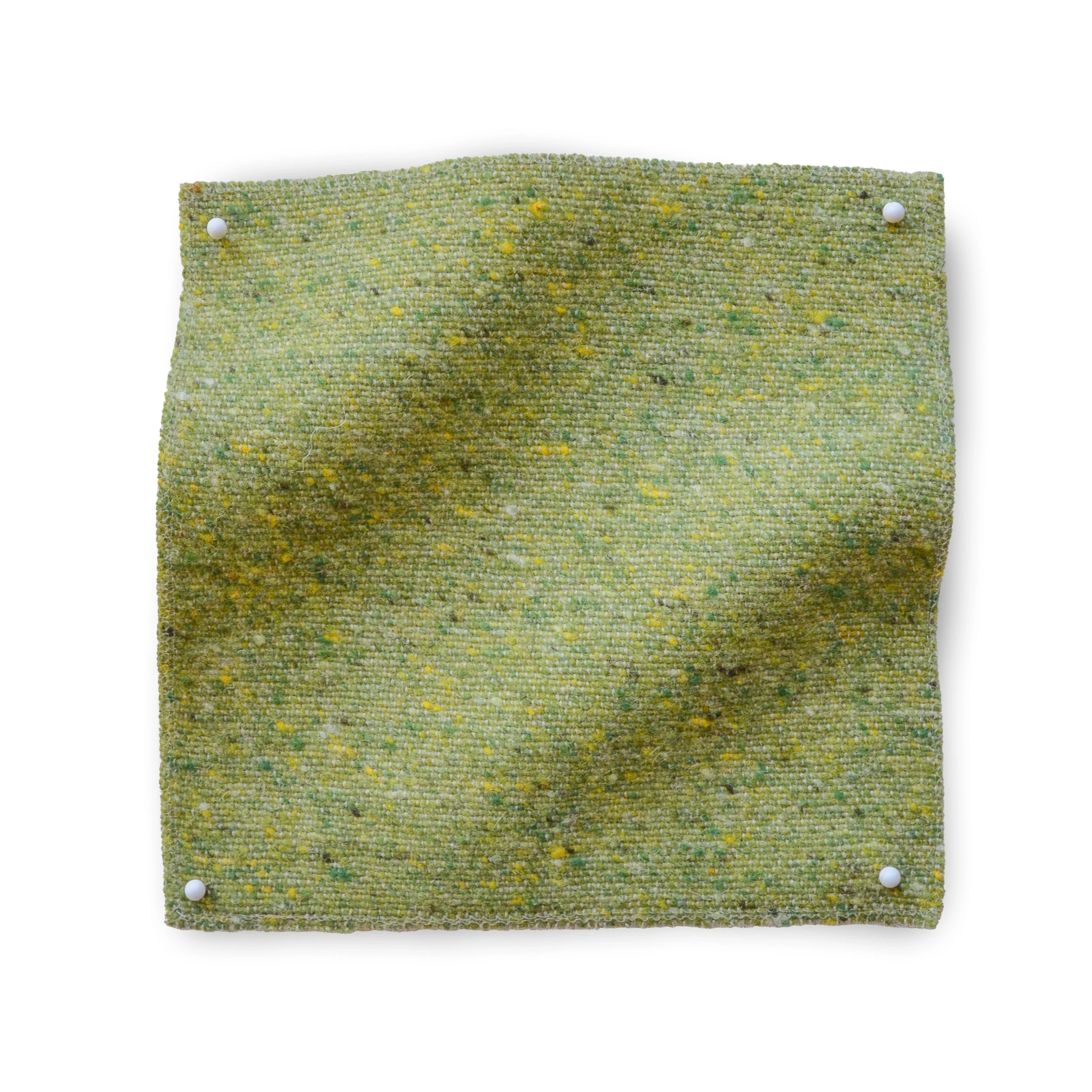
Our beautiful tonal, flecked wools are woven in Scotland. Inspired by the Scottish landscape and parklands, each colour mirrors hues found in the natural world, offering robust and durable fabric suitable for both commercial and residential settings.
COMPOSITION
Composition: 88% Wool, 12% Nylon
Width: 140cm
Weight: 510 gsm
Martindale: 100,000
FR: BS5852 source 0,1,5 & BS5867: 2008 Part 2 Type A
Care: Dry clean only
HOW TO ORDER
Please get in touch with us for trade pricing and lead times.
Sign up for a trade account or locate your nearest showroom here.
IMPORTANT INFORMATION
When placing an order, please allow a +/- 5% tolerance on all pattern repeats and provided widths.
Possible colour variations due to screen displays might occur; we advise ordering a sample online or from a nearby showroom before making a purchase.

A geometric weave, Emmy Lou Fabric is inspired by trellis-like structures and provincial patterns. This contemporary diamond-check pattern adds a subtle texture to its beautifully Jacquard-woven surface. Emmy Lou Check is a perfectly complementary, small all-over pattern that can seamlessly integrate into any design scheme
DIMENSIONS
Repeat width: 6.1cm
Repeat height: 3.25cm
Fabric width: 140cm
COMPOSITION
Composition: 75% Cotton 25% Linen
Weight: 350 gsm
Martindale: 35,000
Woven in the UK
Care: Dry clean/delicate wash
HOW TO ORDER
Please get in touch with us for trade pricing and lead times.
Sign up for a trade account or locate your nearest showroom here.
IMPORTANT INFORMATION
A lining is recommended for upholstery. Please contact us for fire coating to order.
When placing an order, please allow a +/- 5% tolerance on all pattern repeats and provided widths.
Possible colour variations due to screen displays might occur; we advise ordering a sample online or from a nearby showroom before making a purchase.

A botanical weave, our Sarah Louise Fabric features an expressive, gestural pattern inspired by the outdoors. Wildflowers and leaves meander across the surface of this design, creating a versatile woven pattern that is also reversible.
DIMENSIONS
Repeat width: 36.5cm
Repeat height: 78cm
Fabric width: 140cm
COMPOSITION
Composition: 75% Cotton 25% Linen
Weight: 350 gsm
Martindale: 30,000
Woven in the UK
Care: Dry clean/delicate wash
HOW TO ORDER
Please get in touch with us for trade pricing and lead times.
Sign up for a trade account or locate your nearest showroom here.
IMPORTANT INFORMATION
A lining is recommended for upholstery. Please contact us for fire coating to order.
When placing an order, please allow a +/- 5% tolerance on all pattern repeats and provided widths.
Possible colour variations due to screen displays might occur; we advise ordering a sample online or from a nearby showroom before making a purchase.